
February 24, 2026
Key takeaways
Brands simplify their logos all the time. Sometimes it sharpens recognition and makes the brand feel more modern and consistent. Other times it sparks backlash, confusion, and an expensive reversal.
A common reason is that the work gets framed the wrong way. Many companies say “rebranding” when they actually mean “logo redesign.” A logo redesign updates one element of the visual identity. Are brand is broader: it clarifies (or changes) what the brand stands for: its positioning, promise, offer, and messaging, and then expresses that strategy through identity.
That distinction matters because a logo is an amplifier, not a fix. If positioning is unclear and the brand promise is weak, a cleaner logo rarely creates differentiation. It often makes the brand look more generic.
This article looks at why the minimalist wave happened, what simplification is really trying to solve, and two well-known outcomes: Mastercard, where simplification strengthened recognition, and Gap, where it weakened recognition and was quickly reversed.
The "minimalist" wave and whether to adopt it
The shift from detailed, expressive marks to simpler ones is often described as a design trend. In practice, it is mainly a performance decision.
Brands now live in environments where attention is limited, and formats are constrained: mobile screens, app icons, e-commerce tiles, third‑party market places, bank interfaces, payment terminals, social feeds, and partner communications. In those contexts, highly detailed logos and complex lockups often degrade, become illegible, or get applied inconsistently.
So the real leadership question isn’t “Should we go minimalist?” It’s:
What do customers already use to recognise us instantly, and how do we protect those cues while improving performance across touchpoints?
Why brands simplify logos in the first place?
A logo used to live primarily in controlled physical formats: storefront signage, print, packaging, brochures, and outdoor advertising. Today, it must perform across a fragmented ecosystem that the brand does not fully control.
Simplification usually aims to solve four operational problems:
However, simplification has a failure mode: removing distinctive assets before the brand has a clear strategy and recognisable cues. That’s when brands end up with a “clean” identity that could belong to anyone.
Mastercard: Simplification that strengthened recognition
Mastercard is often cited as a successful example of simplification because the redesign improved performance without forcing customers to relearn the brand.
By the time Mastercard simplified its identity, the brand was operating at global scale across many touchpoints: cards, payment terminals, e-commerce checkout flows, mobile apps, bank interfaces, sponsorships, and partner communications. In many of those contexts, the brand appears as a small signal embedded inside someone else’s interface.
Instead of introducing a new visual idea, Mastercard simplified by reinforcing its strongest existing recognition cue: the overlapping red and yellow circles. Those circles already carried brand memory. The redesign made them cleaner, more legible, and easier to deploy.
Crucially, Mastercard treated identity as a system, not a single logo file. When space allows, it uses the full lockup (circles + name). When space is tight, it uses the circles alone as a valid shorthand. That approach keeps recognition intact across contexts and steadily increases the brand’s ability to be recognised even without the wordmark.
In other words, Mastercard simplified what was limiting performance while protecting what people already knew.

Gap: Simplification that weakened recognition
Gap’s 2010 redesign is a useful counterpoint because it shows how simplification can reduce brand performance when it breaks recognition.
Gap had a strong and widely recognised cue: the blue box. Over time, that cue became a shortcut in customers’ minds. People could spot Gap quickly in a mall, on signage, and online without effort.
In early October 2010, Gap replaced the blue box on its website with a black “Gap” wordmark and a small blue square behind the “p”. The change removed the brand’s most distinctive visual cue and replaced it with something that looked generic relative to other retail wordmarks.
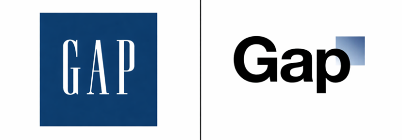
The rollout also made the change feel abrupt and uncertain: it appeared suddenly with no transition strategy, and the company publicly explored alternatives after backlash began. The reaction was immediate and intense, and Gap reversed the change within days.
Gap’s case illustrates a simple principle: simplification only creates value when it makes the brand easier to recognise and apply consistently. If simplification removes a cue people rely on and fails to replace it with something equally distinctive, recognition weakens, even if the new design looks cleaner.
What these two outcomes teach leaders?
The difference between Mastercard and Gap is not “good taste vs bad taste.” It is how each brand treated recognition, distinctiveness, and change.
1) A logo is an expression of strategy, not a substitute for it
If you’re using a new logo to signal “we’ve changed,” start by making the change real and clear:
When those are sharp, the visual identity can become a powerful amplifier. When they’re fuzzy, simplification tends to flatten the brand.
2) Protect distinctive assets; simplify everything else
The aim isn’t minimalism. The aim is to stay distinctive while improving performance.
The most common failure is simplifying toward a generic centre: samefonts, same geometry, same neutrality. That reduces memory value. A strong simplification keeps (or clarifies) the cues that make the brand recognisable, and removes what doesn’t scale.
3) Treat identity as a system across touchpoints
Mastercard’s success wasn’t just the mark. It was the system logic (fulllockup vs shorthand) and its adaptability across environments.
When leaders ask, “Should we redesign the logo?”, a better question is:
Does our identity system work across digital, physical, product UI, packaging, and partner environments, and do we have rules that preserverecognition?
4) Rollout and governance are part of the work
A redesign isn’t finished when the logo file is approved. Sequencing, testing, explanation, and internal governance determine whether recognition breaks in the real world.
Conclusion
Minimalism is not anobjective. It’s a tool.
Used well,simplification improves recognition, consistency, and execution across modern touchpoints. Used poorly, it removes familiarity and makes the brand harder toidentify, often turning a unique brand into a generic one.
The practical rule is straightforward: clarify the brand’s positioning and promise, identify the cues people already use to recognise you, protect those cues, and simplify only whatlimits performance.
At Binomial Consulting, we'll help you determine your brand promise so that your brand Is well-positioned to plan, grow, and create long-term trust. Contact us to position your brand up for success.